AsadMemon
Everything is Optimized, Everything is Same
I am collecting examples of a weird phenomenon where we are losing our taste for the unique and diverse. All our music, buildings, cities, UI, etc looks the same.
The logical answer is that as things are optimized, they converge to a local maxima. This combined with the hyper-connected world we live in, results in nobody escaping the local maxima.
Maybe it's the tyranny of the marginal user. Is it the weak CEOs and their "Nobody Gets Fired For Buying IBM" mindset. I am not too sure yet.
This is a real disaster that is really bumming me out!
Below is a list of examples I have collected so far. I'll keep adding to this list as encounter more examples.
If you have any examples, feel free to share below. I'll add them to the list and credit you.
Cars: The Fading Spectrum of Expression
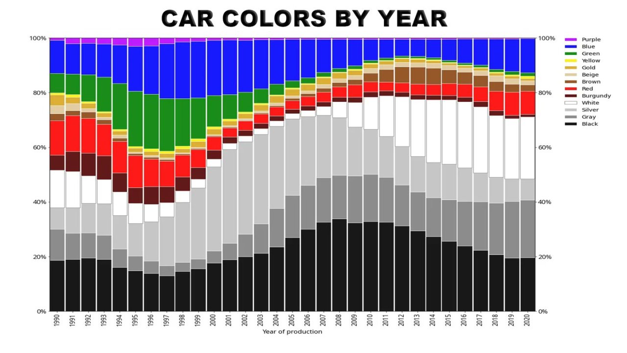
The automotive industry offers a vivid portrayal of the shift toward uniformity. Over the years, the colors of cars on the road have transitioned from a vibrant spectrum to a monotonous sea of gray, white, and black. While these colors may signify elegance and modernity, they also reflect a diminishing range of individual expression on the road. Are we sacrificing personal style and identity for a sense of conformity?

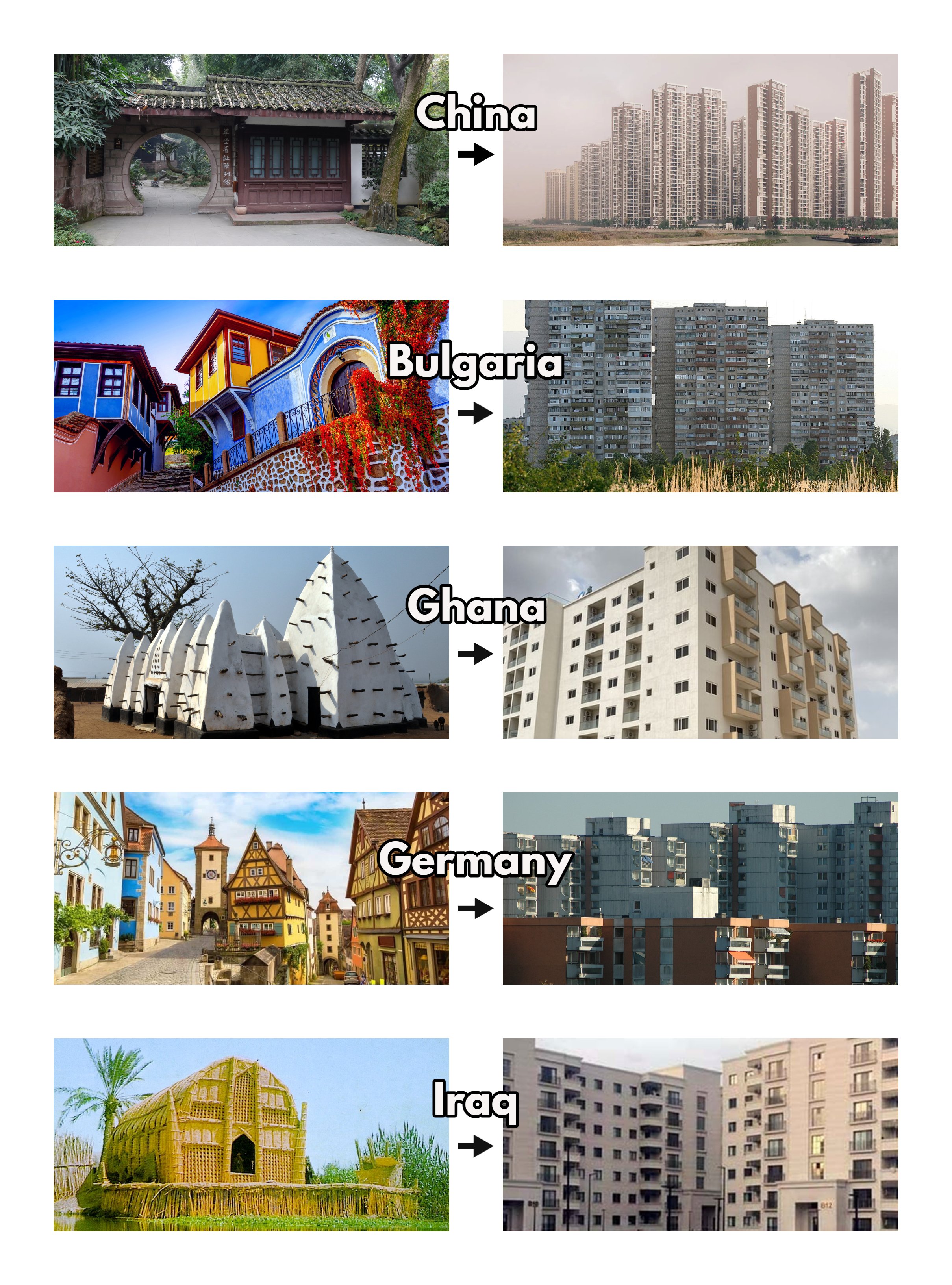
Architecture
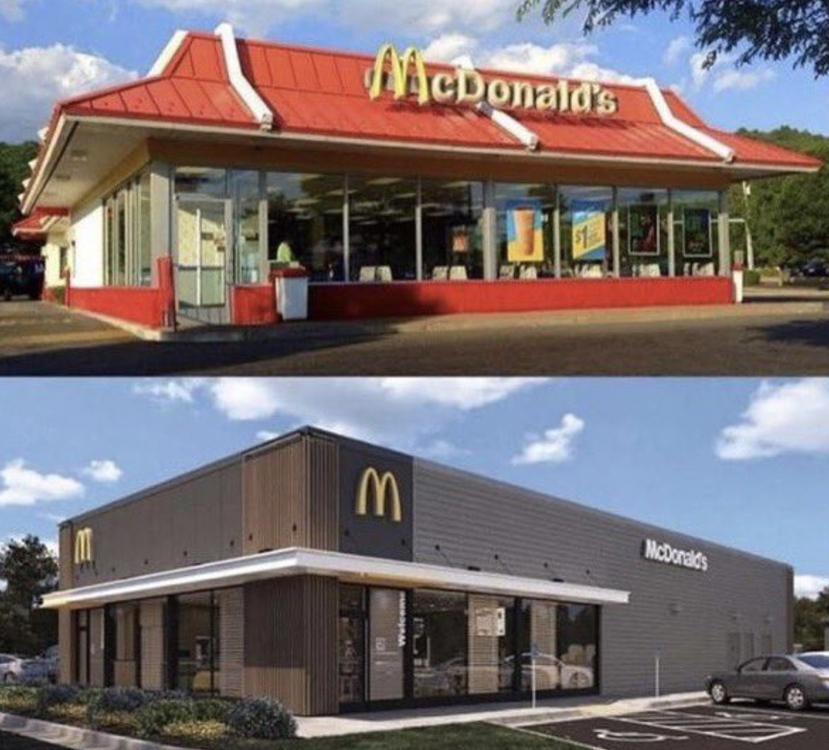
Modern buildings may be sleek and functional, but a sense of nostalgia for the ornate and diverse structures of the past lingers. As architecture embraces minimalist designs and uniform aesthetics, are we losing the distinctive identities that once defined cities and neighborhoods?





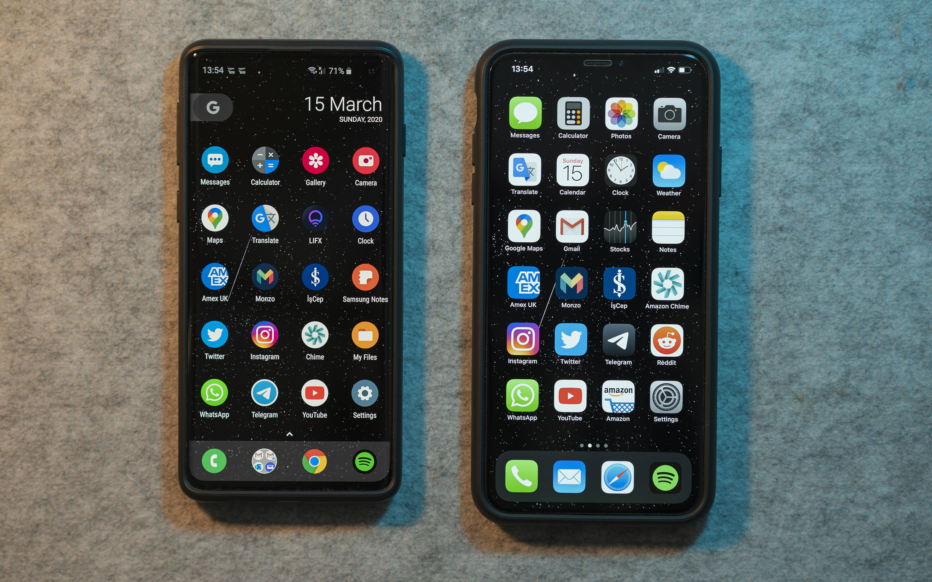
UI Minimalism: Streamlined Yet Uniform
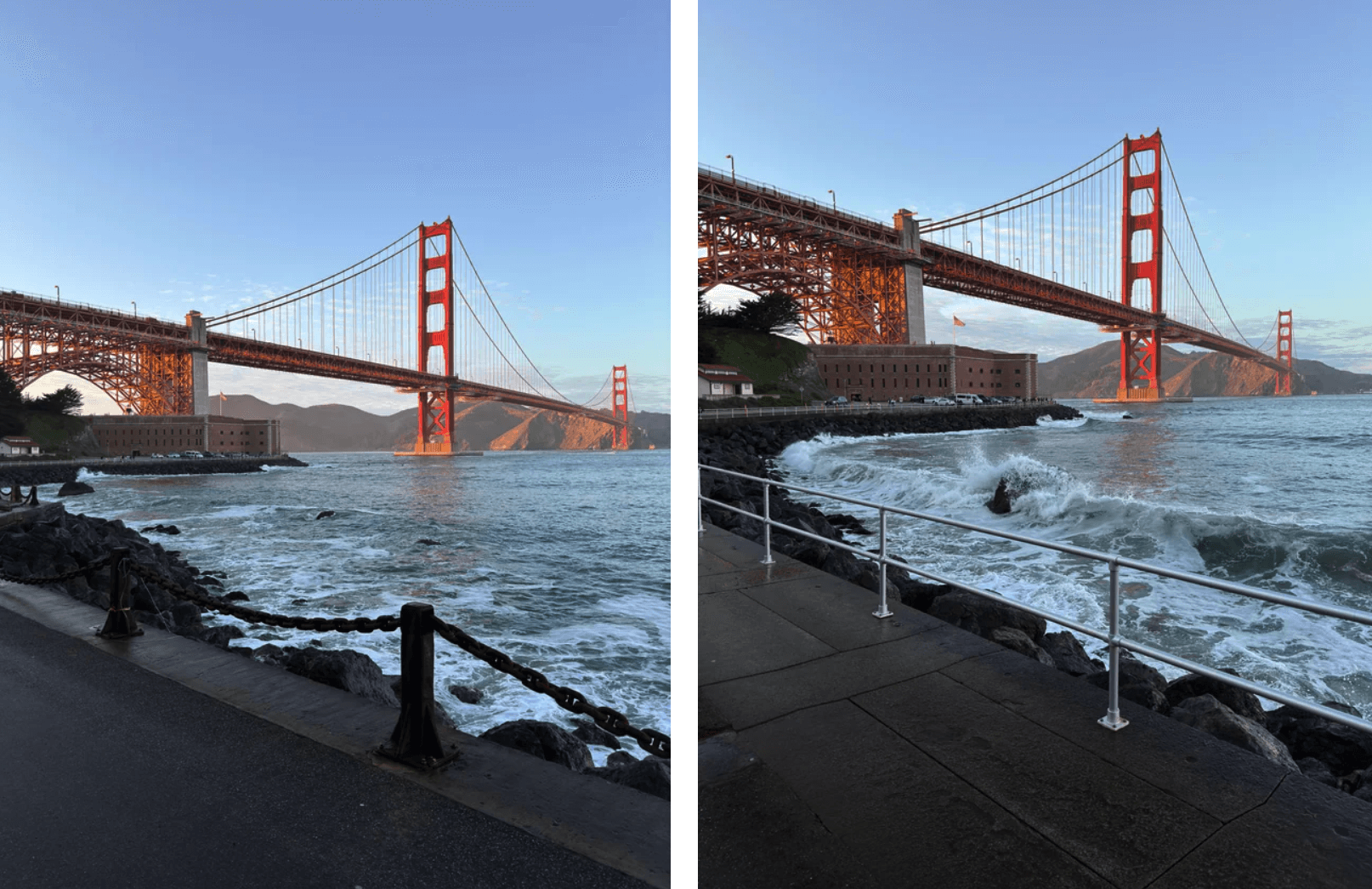
User interfaces have evolved significantly, becoming streamlined and intuitive. However, this shift towards UI minimalism has also led to a certain uniformity in design. Android and iOS look just the same,.

Content: From Diversity to Convergence
The convergence of diverse content into a "content sludge" is strikingly visible. The vast array of entertainment options at our fingertips seems to paradoxically contribute to a more uniform viewing experience. As genres blend and narrative structures converge, the boundary-pushing, genre-defying content that once flourished could be dwindling in favor of easily digestible and predictable plots.
Music: Homogenization of Sound
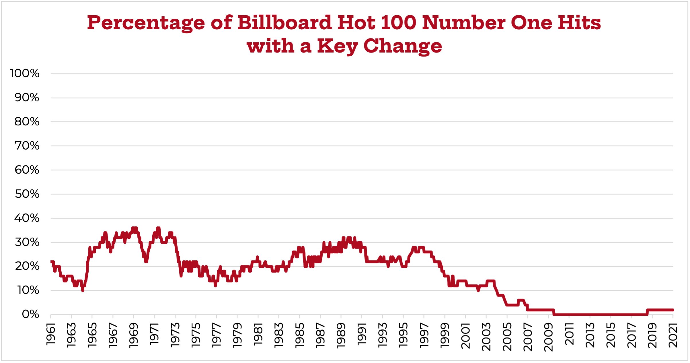
The realm of music provides another perspective on this phenomenon. While the past witnessed a proliferation of diverse musical genres, today's mainstream music landscape often leans toward generic pop or "chill" vibes, with a homogenization of sound that's hard to ignore. Key changes, a staple of musical evolution, have become less common in popular songs, potentially contributing to a sense of monotony.
