AsadMemon
Scrollbars: Evolution Gone Wrong

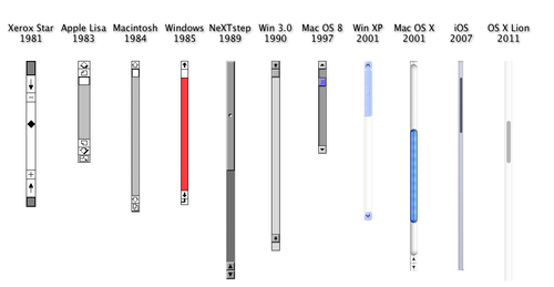
I am a smartphone user and these new touchscreen devices have changed a lot of UI Elements and brought new concepts through this ‘gestures’ thingy. But I couldn’t help but notice that we are silently killing scrollbars. Many think that’s a good thing (including me), but I have a little concern of my own.
A scrollbar mainly allows two methods of scrolling though the content. You can use the arrow buttons as an alternate to UP/DOWN arrow keys. Or you can fast scroll through the content using the pivot thingy. Touch screens have solved the slow scroll functionality by using gestures, swipe up and swipe down to scroll respectively. But they haven’t yet solved the fast scroll method of jumping to some area of the page.

Above you can see this large page about pac-man on my phone. Notice the tiny scrollbar to the right displaying my current position.
Now, WHAT IF I WANT TO SCROLL TO THE TOP…I have to scroll through the entire thing!

I am in favor of eliminating the scrollbars, but not until we have a solution to this particular problem.